

Written by Dianne Frisbee
This moment wouldn’t be possible right now without typography.
Sure, print media lead to the advancement of humankind through technology, the arts, and the mass spread of knowledge. But I’m specifically talking about something far more important. This exact moment that you are experiencing right now — reading the words I have written — wouldn’t be possible.
You probably learned about the invention of the printing press in school. But you probably learned less about the invention of the font. Which is equally as important, if you think about it. Without fonts, it would just be a press with nothing to print. The very first font, Blackletter, was designed to mimic handwriting. But fonts have evolved through experimentation and creativity.
Each societal breakthrough in technology has coincided with the creation of typefaces. The Industrial Revolution saw a flood of new fonts. The computer boom of the late 20th century also saw inventive fonts arrive on our digital screens. Welcome to the world, Comic Sans.
As we are in the midst of a new technological revolution that puts more of an emphasis on virtual 3D spaces, it felt appropriate to dedicate this edition of People and Artifacts - A Design Deep Dive to the five most influential designers of typography from the last century.
But before we dive in, consider what makes for a great typeface. When we learn our ABCs as a child, we take for granted that an A looks like an A and a Z looks like a Z. The art of typography is all about balancing that clarity with creative expression. To be truly great, a font must be recognizable and distinct, showing its personality through nuance.
Let's see how these five designers elevated the art of typography.
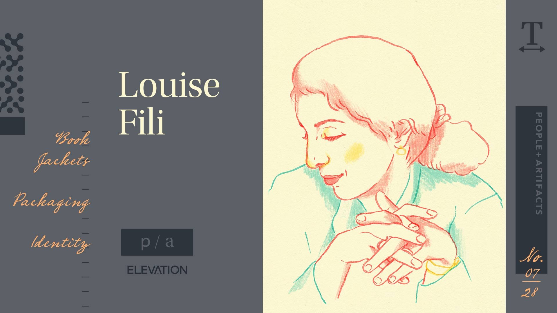
Louise Fili (1951-)
Notable Works: Art Director of Random House’s Pantheon Books, Packaging and Restaurant identity Tate’s Cookies, Via Carota
Bio
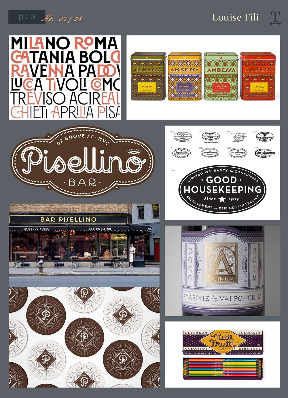
The daughter of Italian immigrant school teachers, Louise Fili’s career got off to a prolific start. One of her early stops was as a senior designer for Herb Lubalin, the next designer featured in this list. As art director for Pantheon Books, she designed almost 2,000 book jackets, where use of font is paramount. In 1989, she opened her own graphic design studio. While the company has stayed the same small size of herself and two additional designers, Fili has been able to make a huge impact. Her firm focuses on strategic brand development for restaurants such as Via Carota and Juliana’s, as well as specialty food products including Tate’s Cookies and Marcus Samuelsson.
While traveling, Fili spends time combing flea markets and documenting signage. This habit is apparent in her work, which has an elegant, tactile quality.
Style, Impact, and Observations
With an affinity for European modernism with geometric, Cubist-like designs, Fili has a with creating branding that is intuitive — feeling as though it has always been that way. A logo designed from Louise Fili makes your brand feel like it has a history rooted in family heritage. But her text-forward designs don’t just borrow from the past. Her work is infused with personality and perspective, transforming food packaging into art for your home.
Her designs deftly and expressively use typography to elevate any product.
Resources
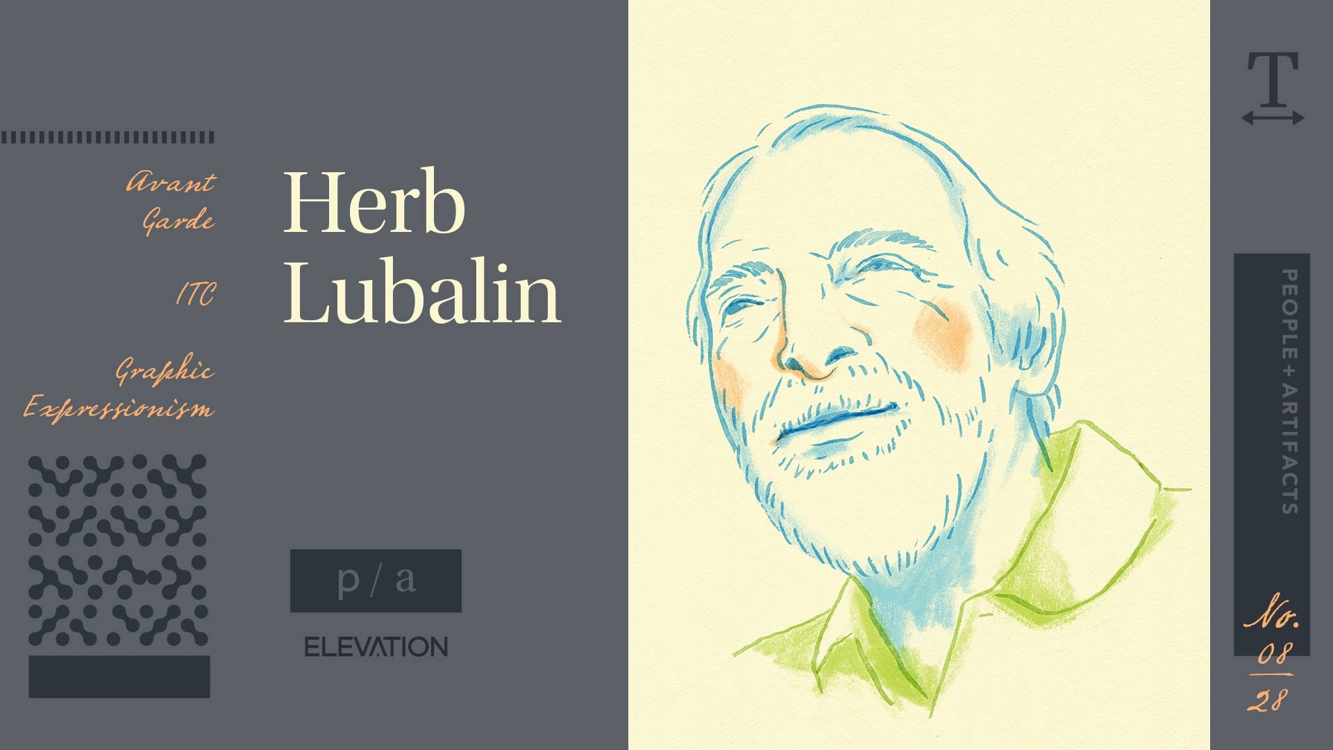
Herb Lubalin (1918 - 1981)
Notable Works - Eros, Avant Garde Magazine and Font, International Typeface Corporation (ITC)
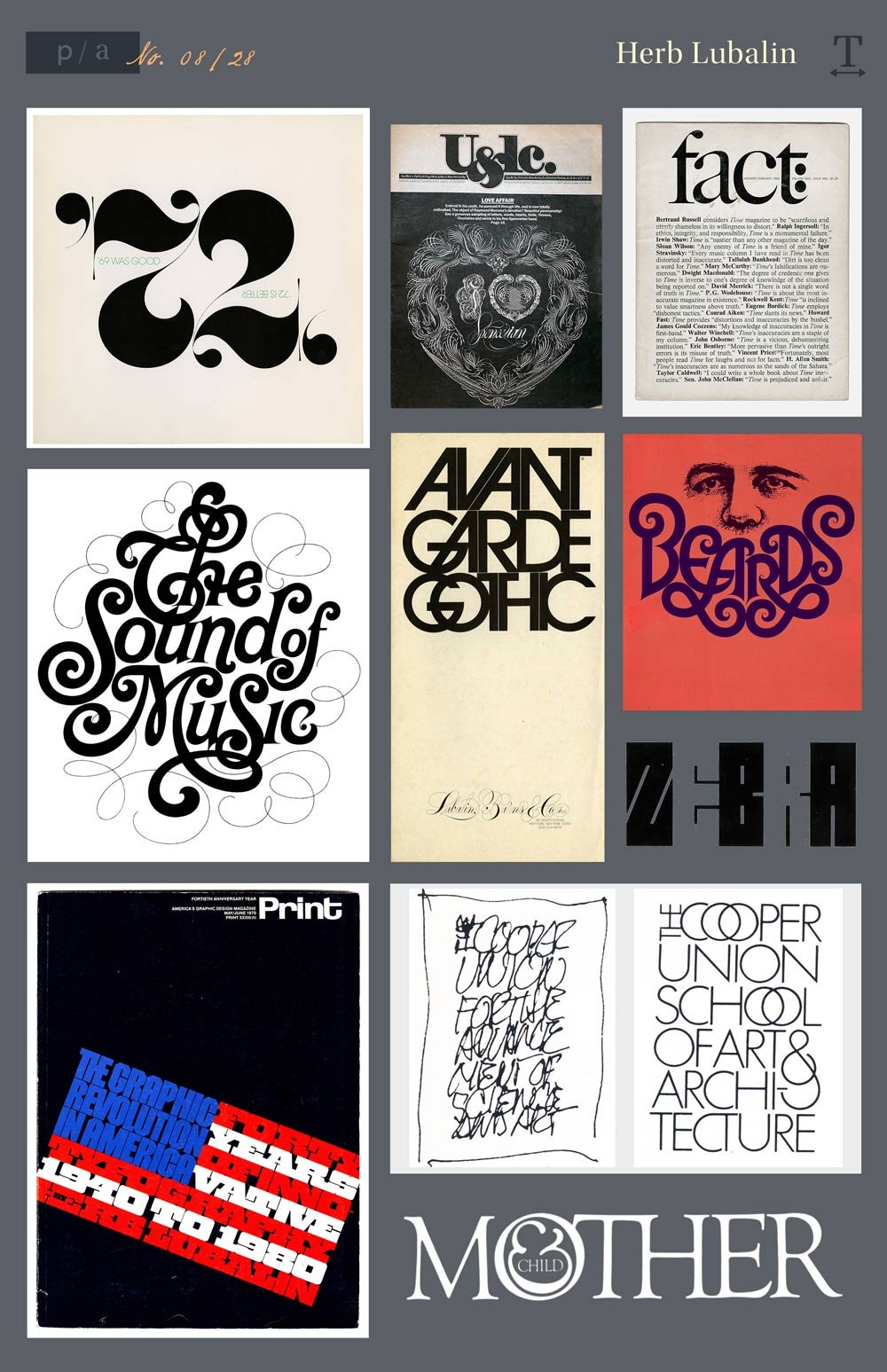
A boundary breaker on both the visual and social level, Herb Lubalin was a pioneer of expressive typography. Early in his career, Lubalin worked at marketing agency Sudler & Hennessey, where created the original NBC Peacock with John J. Graham.
Lubalin started his own firm in 1964, the same year he designed his first typeface — Pistilli Roman. This font was was used for the trademarks for Lincoln Center, the New York Philharmonic, and the Metropolitan Opera. Lubalin became most famous for his work for the magazines Eros, Fact, and Avant Garde. For that last magazine, Lubalin developed a complete typeset based on the logo through his International Typeface Corporation. ITC Avant Garde was described as “Lubalin’s signature” in Steven Heller’s Herb Lubalin: Rule Basher.
Herb was known for sketching all of his ideas on tissues and handing them over to other designers to finish.
Style, Impact, and Observations
“A picture is worth a thousand words.” For Herb Lubalin, the words were the images. Lubalin actually described typography as “word pictures.” Herb Lubalin had a unique ability for defining the perfect visual voice while letting the type talk for itself. He embraced Spencerian script lettering styles that were prominent prior to the typewriter.
Lubalin was adamant about not having a specific style, but his use of as images was in contrast to modern Swiss graphic design that was practiced after the First World War. Rather than pursuing European minimalism, he developed ‘graphic expressionism.’ In an essay he wrote in 1979 for Print magazine he said, “Graphic Expressionism is my euphemism for the use of typography, or letterforms, not just as a mechanical means for setting words on a page, but rather as a another creative way of expressing an idea, telling a story, amplifying the meaning of a word or phrase, to elicit an emotional response from the viewer.”
While he appreciated “Swiss Style,” he thought it wasn’t right for American imagination. As he told IDEA magazine: “The American people react to ideas. We are a concept-conscious society.”
Resources
https://www.uniteditions.com/blogs/news/ten-things-you-should-know-about-herb-lubalin
http://www.designishistory.com/1960/herb-lubalin/
https://lubalincenter.cooper.edu/
https://en.wikipedia.org/wiki/Herb_Lubalin
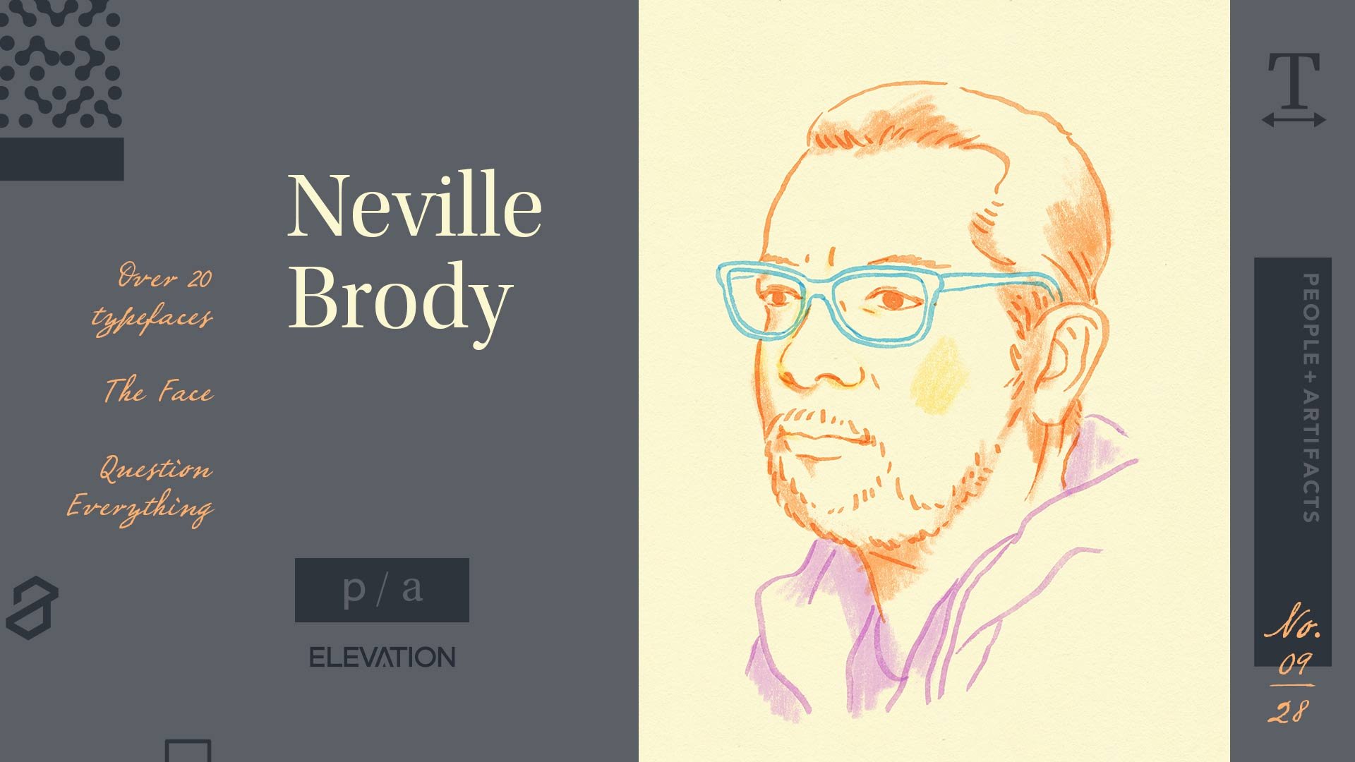
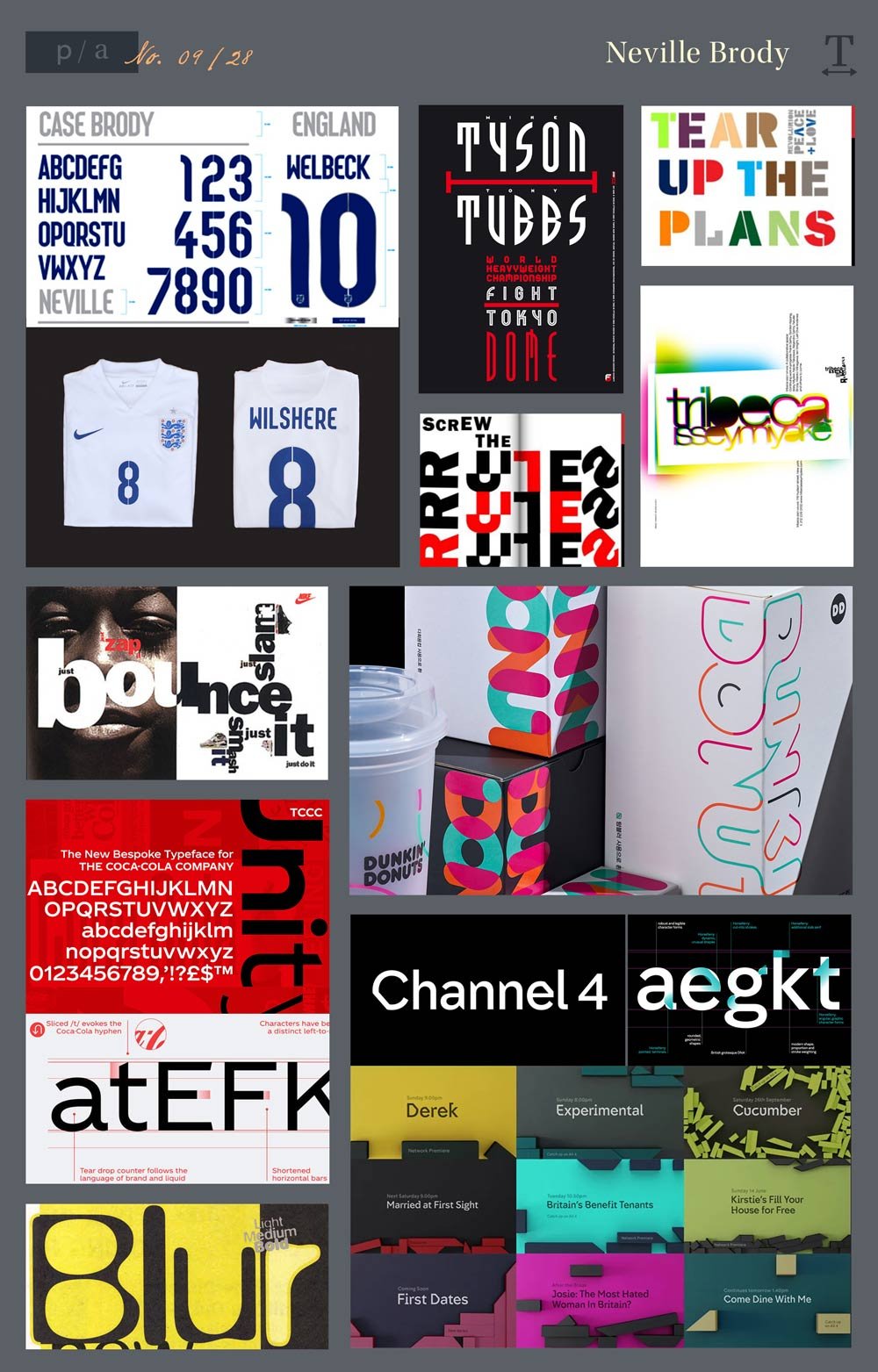
Neville Brody (1957-)
Notable Works: The Face and Arena magazines, Covers for Depeche Mode, radical redesigns for The Guardian and The Observer, Designed over 20 typefaces
Bio
As a student at the London College of Printing in the late 1970s, Neville Brody’s professors derided his designs as “uncommercial.” This was predictable, as Brody’s influences included Pop Art, Dadaism, and Punk Rock. In fact, Brody took a Punk approach to design, stripping everything back to basics.
His professors’ concerns proved to be unfounded. Brody gained attention as the art director for The Face magazine, which he described as a “living laboratory where I could experiment and have it published. Our golden rule was to question everything.” With The Face, Brody played with the structure of text blocks and use of white space. This was employed to change the pace of reading and create spaces for the audience to pause and reflect.
In 1994, Brody founded Research Studios, now known as Brody Associates. His firm now has offices in London, Paris, Berlin, and Barcelona. Brody also founded type foundry Fontworks and has created 21 typefaces.
Style, Impact, and Observations
Weird and wonderful. Loud, yet controlled. Neville Brody is the prime example of how being unconventional can help a designer develop their voice. His designs force you to look twice and linger on them.
The fundamental principle behind his work is experimentation. He displayed this early in his career with his Punk sensibilities, but he continued to experiment as an avid user of the computer as a design tool.
Resources
http://www.designishistory.com/1980/neville-brody/
https://medium.com/@evacrawfordmckee/typographers-neville-brody-5b192ad6757a
https://brody-associates.com/
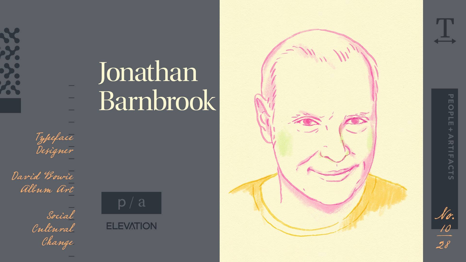
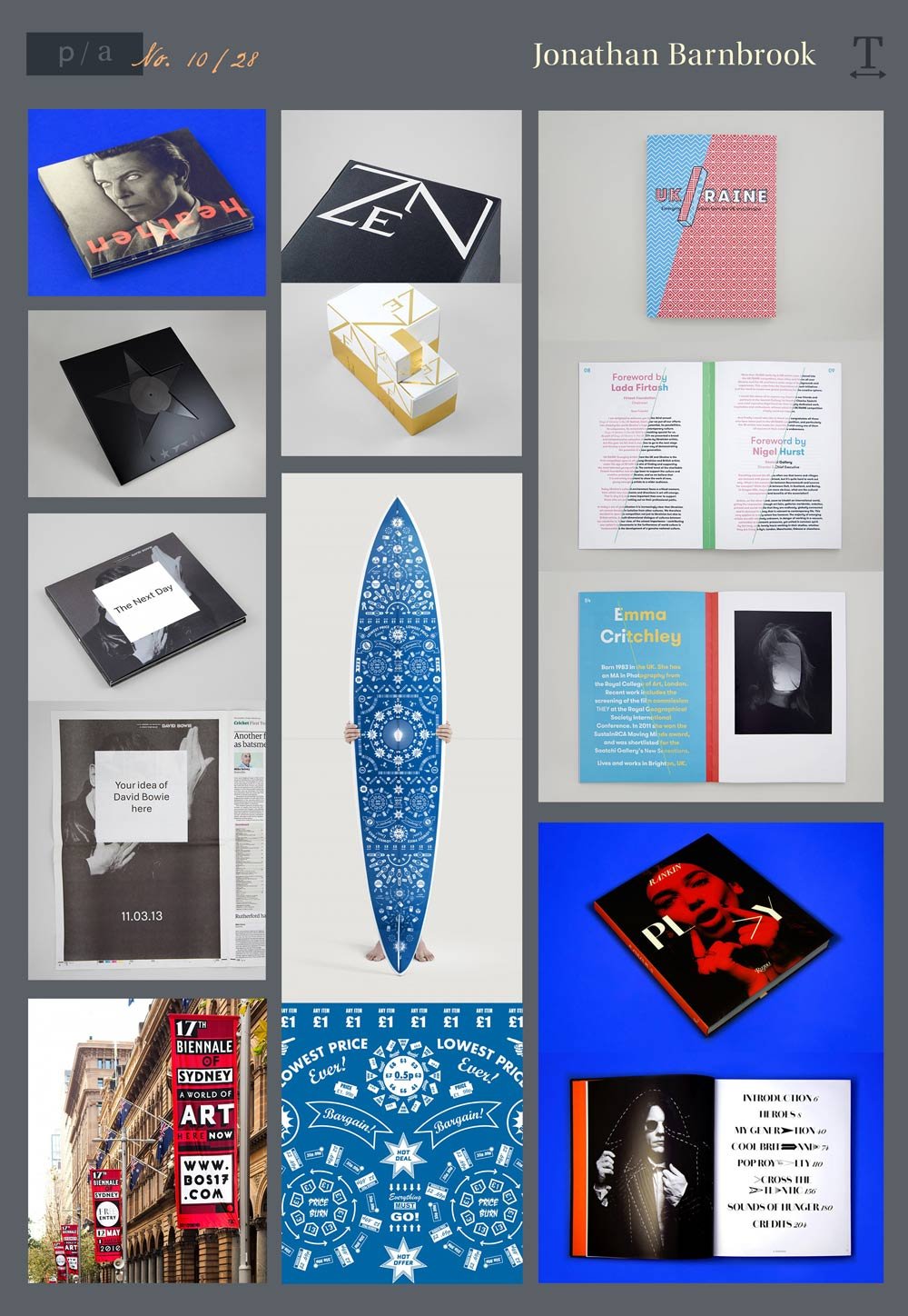
Jonathan Barnbrook (1966-)
Notable Works: David Bowie’s album Heathen in 2002, Typeface Design: Mason, Roppongi Hills - Branding for Tokyo Development
Bio
Another prolific British graphic designer, Jonathan Barnbrook founded Barnbrook Design in 1990. Cover artwork for records was a lifelong interest, and Barnbrook designed the sleeves for the David Bowie albums Heathen, Reality, The Next Day, and Blackstar. He also has designed several Museum Catalogs and Exhibition Identities.
Barnbrook has designed fonts with emotive and controversial names that reflect the themes of his work. His fonts include False Idol, Exocet, Newspeak, Sarcastic, Infidel, Shock, Moron, Mason and Priori.
Barnbrook’s work is highly motivated by his personal believes about social, cultural, and environmental world issues. As an early signer of the First Things First 2000 manifesto, he pledged to use graphic design as a tool for social change and justice.
Style, Impact, and Observations
While his fellow countryman Neville Brody exuded punk rock, Barnbrook’s work is less chaotic and more controlled and puproseful. Everything is by design, and everything is deliberately placed and considered. From his take on vernacular graphics to his use of type as texture, Barnbrook uses typography in clever and inventive ways.
Jonathan Barnbrook commits to an idea and carries it across an entire branding campaign, such as the A’s in the book “Play,” the negative space for Bowie’s The Next Day, and the visual dichotomy created for the UK/Ukraine emerging artists book.
Resources
https://barnbrook.net/
https://www.famousgraphicdesigners.org/jonathan-barnbrook
https://ideasondesign.net/speakers/speakers/jonathan-barnbrook/
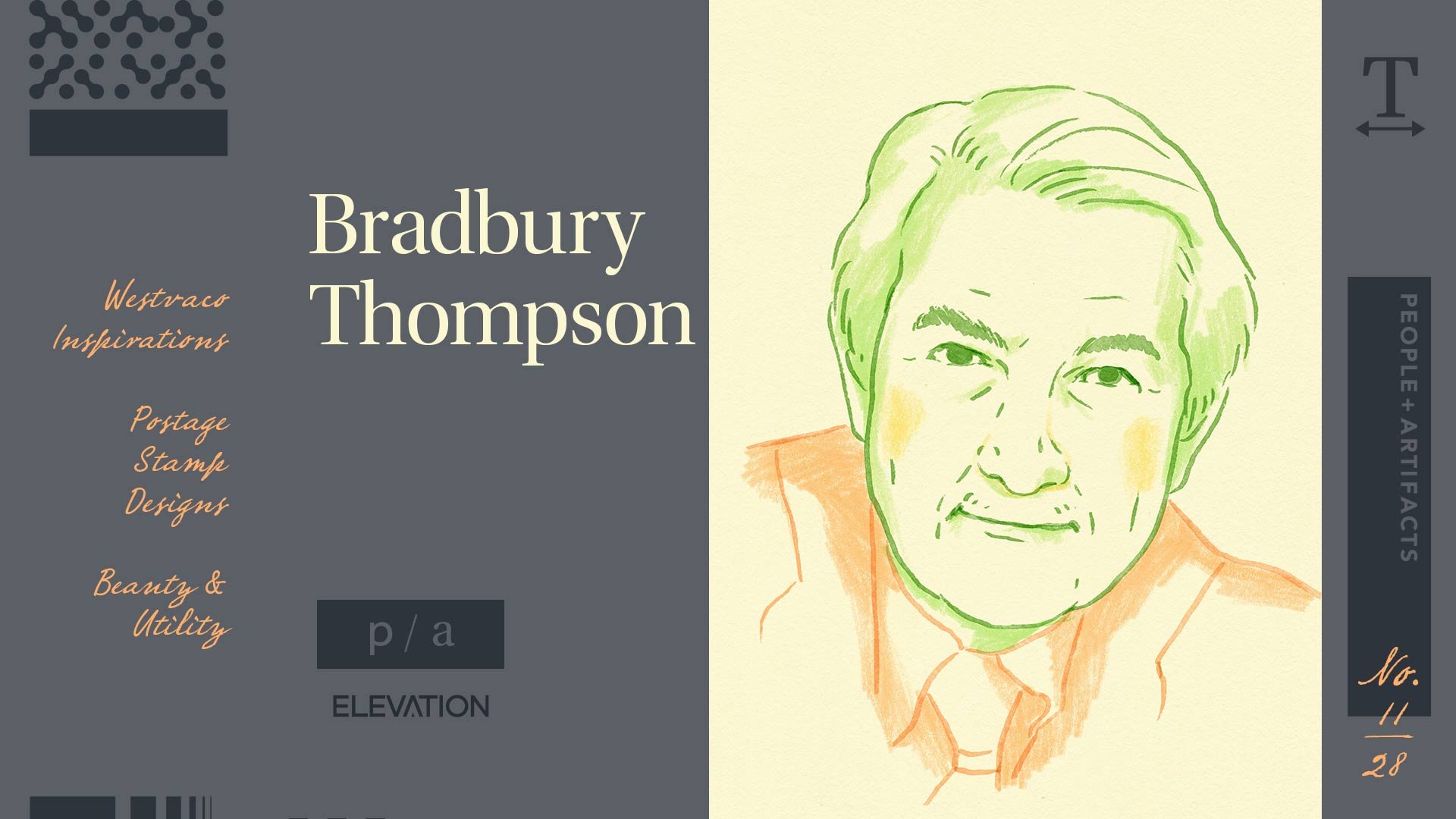
Bradbury Thompson (1911 - 1995)
Notable Works: Westvaco Inspirations, The Washburn College Bible, USPS postage stamp designs
Bio
An American graphic designer who grew up in Topeka, Bradbury Thompson moved to New York in 1938. He spent the rest of his life there, exploring his craft and building his career. Thompson was responsible for the typeface in the Washburn College Bible, which was described as “the most monumental and innovative reassessment of bible typography since Gutenberg’s own edition” (source: RIT/Cary Graphic Arts Collection). His designs for the USPS postage stamps captured American history and culture.
Bradbury left a lasting influence on modern graphic design, serving on the faculty for the Yale School of Art for over three decades.
Comparing fonts to architecture, Bradbury said, “The art of typography is concerned with beauty and utility.”
Style, Impact, and Observations
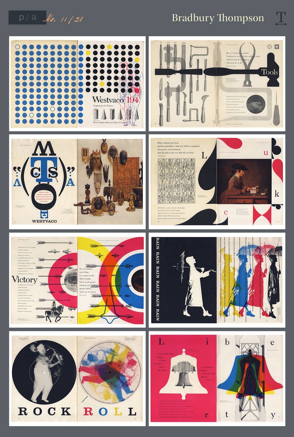
Bradbury Thompson had a remarkable ability to blend typography with photography and color. This made him an extremely versatile designer. He was a master of composition, deftly creating visual flow and progression throughout his spreads.
Thompson believed that designers needed an understanding of the past, but also be able to create for the time they’re living in. This belief was apparent in his own work.
Bradury Thompson’s aesthetic was similar to Alexy Brodovitch before him and his contemporary, Paul Rand. All three of these designers pushed boundaries, employed a sense of play, and elevated the art.
The Westvaco Inspirations series was an ideal platform for showcasing his talents as well as his resourcefulness. Because the publication was intended to demonstrate printing processes and papers, Thompson was given no constraints except financial ones. The budget limited him to using borrowed plates and separations as opposed to shooting photography. These older, print shop elements would serve as the base for him to layer typography and color to create new, modern designs. His designs felt simultaneously classic and contemporary.
Resources
https://www.rit.edu/carycollection/bradbury-thompson
https://www.commarts.com/features/pioneer-bradbury-thompson
https://www.widewalls.ch/artists/bradbury-thompson
People & Artifacts - A Design Deep Dive
Artist profile illustrations by Tonia Yiu.
Stay tuned for additional entries in this series covering the history of design. We will have profiles on pioneers in typography, motion design, and more.
Topics: visual storytelling, People & Artifacts | A Design Deep Dive