.png "People & Artifacts (2)")

Written by Dianne Frisbee
Magazines are one of the most influential mediums in design. Since the publication of the first magazine Erbauliche Monaths Unterredungen in 1663, magazines have informed, influenced, and entertained the public, all on a regular basis. Magazines are known by many names — circulars, periodicals, and even rags. This is the platform of renegades and anti-establishment. But art with underground roots tends to make its way into the mainstream.
Magazines don’t just cover fashion. Magazines are fashion.
We are currently in a moment of constantly changing and evolving mediums. Just as the dust settles on one digital revolution, another radical change is on the horizon with Web3 and the metaverse. To get a clue about where design is going, we’re taking a look back with People & Artifacts - A Design Deep Dive. This series will look at the history of design through the lens of the most influential artists and transformative mediums.
As a medium for the masses, magazines drive and shape popular opinion and tastes.
Roger Clark, Spectrum News 1, speculates that a flattering depiction of candidate Abraham Lincoln on the cover of the November 1860 Harper’s Weekly Magazine is believed to have helped him win the election. One current example of the massive influence of magazines is Apple’s redesign of iPhone lock screens for iOS 16. Apple is using machine learning technology to make it simple for anyone to transform their pictures into a magazine-style cover, complete with a subject overlapping the primary text.
In this edition of People & Artifacts, let’s take a closer look at six of the magazine industry’s rebels from the 20th century to marvel at their forward thinking and lasting influence — from the periodical rack to the phone inside your pocket.
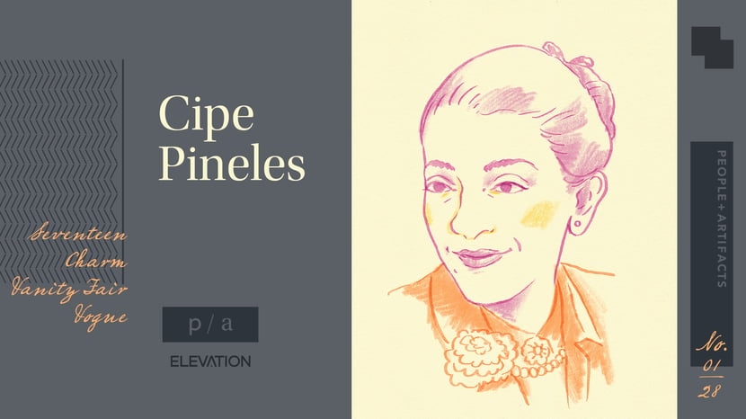
Cipe Pineles (1908 - 1991) - Pioneering Art Director
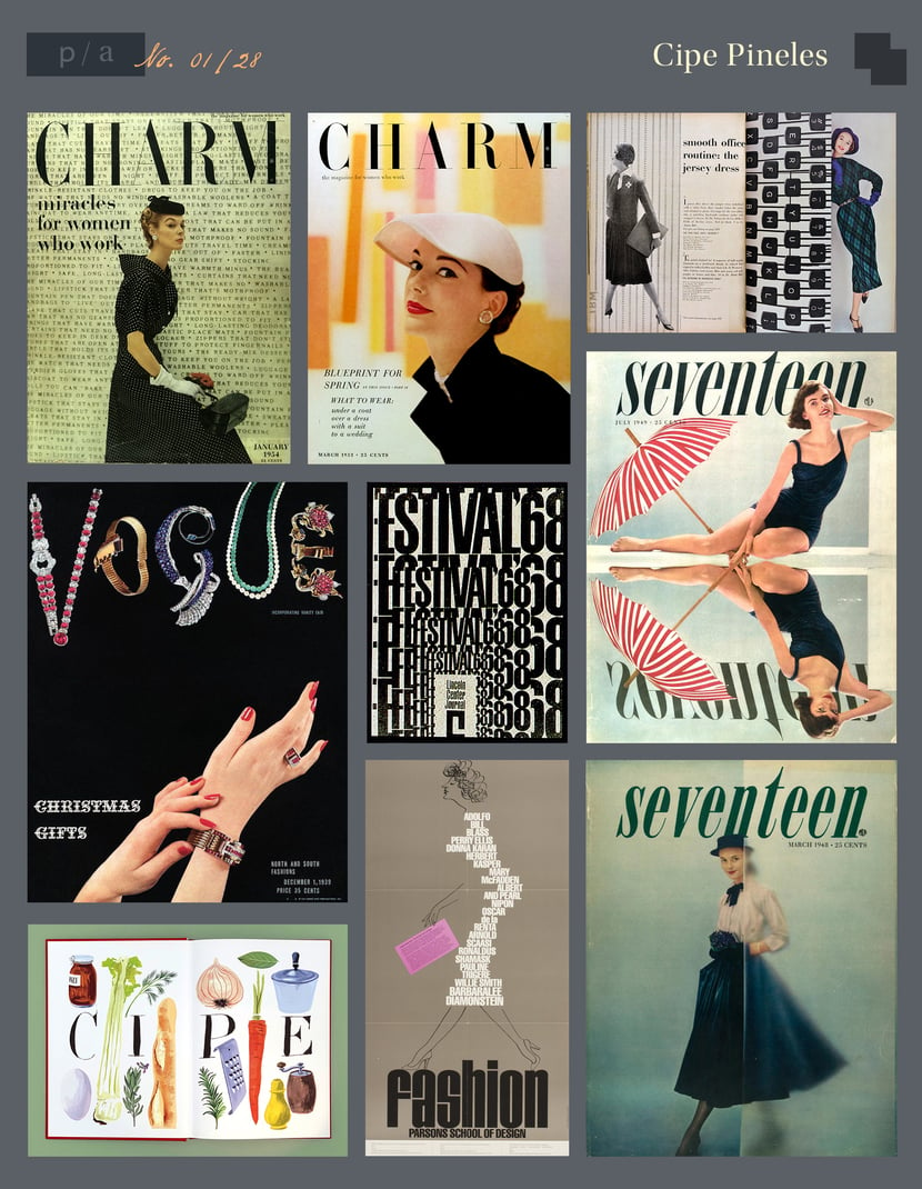
Notable Works: Seventeen, Charm, Vanity Fair, Vogue
Bio
Austrian-born graphic designer and art director, Cipe Pineles made her career in New York at such magazines as Seventeen, Charm, and Mademoiselle. Pineles was a trailblazer as an early — and possibly the first — female Art Director of several high-profile magazines.
Style, Impact, and Observations
Pineles’ style as a “playful modernist” developed through various uses of image and type. She was interested in bringing fine art into mainstream, mass-produced media. During her time at Seventeen, she commissioned fine artists such as Ad Reinhardt and Andy Warhol to illustrate articles.
Cipe Pineles punctuated her work with edited colors and surprising textures. You can feel her refined eye guiding you to the unexpected hidden gem of the composition.
Resources
Scotford, Martha (1999). Cipe Pineles: A Life of Design (1st ed.) New York: W.W. Norton ISBN 978-0-393-73027-2
https://www.eyemagazine.com/feature/article/the-tenth-pioneer
https://www.typemag.org/post/cipe-pineles
https://www.typemag.org/post/the-chemise-in-typography
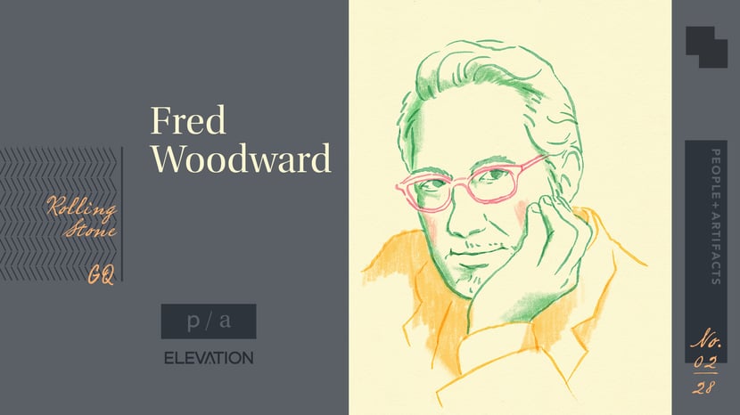
Fred Woodward (1953-) - American Art Director Focused on Editorial Design
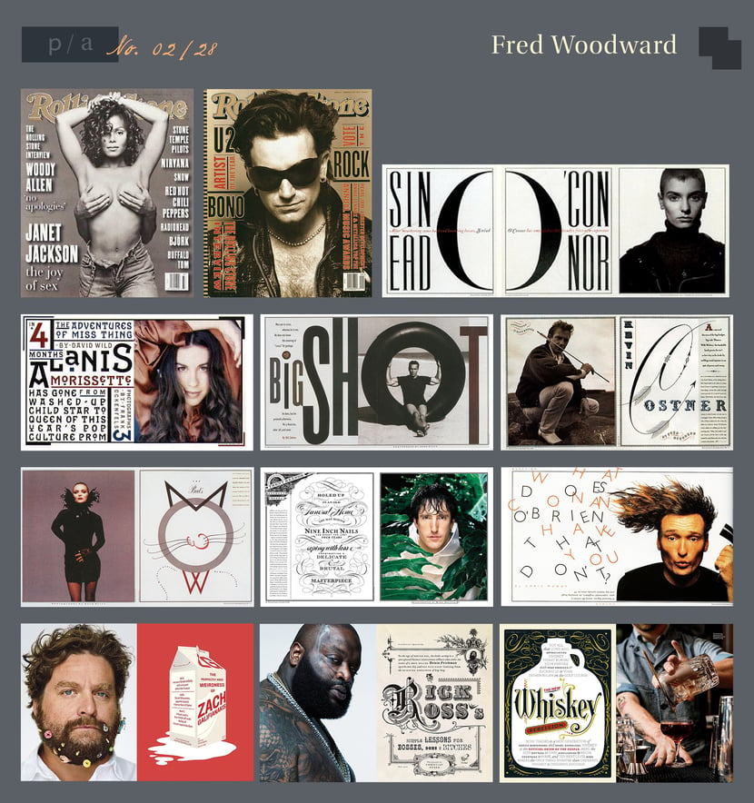
Notable Works: Rolling Stone, GQ
Bio
Growing up in a small agricultural community of around 500 in Louisville, Mississippi, it is remarkable that Fred Woodward would later become the winner of the 2004 AIGA Medal and be considered one of the "20 Influential Designers You Need to Know."
His career started to take off when he went to work at the Sunday Magazine of the Dallas Times-Herald, and later he became the art director of Texas Monthly. However, Woodward’s big break came in 1987 when he was hired at Rolling Stone magazine. It was at Rolling Stone where his cultural impact began to be felt. He oversaw nearly 400 issues during his fourteen years with the magazine. Rolling Stone went on to win more international design awards than any other U.S. magazine, due to Woodward’s distinctive visual style. Since 2001, he has worked as GQ’s Design Director.
Style, Impact, and Observations
His signature style includes a remarkable sensibility for typefaces and how they work in concert with photography.
“Surveying his work, one is struck not just by its formal beauty and appropriateness, but by the sheer virtuosity of its design responses.” - Michael Bierut.
Resources
https://go.distance.ncsu.edu/gd203/?p=24149
https://www.graphis.com/bio/fred20-woodward/
https://art85.patrickaievoli.com/?page_id=1015
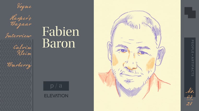
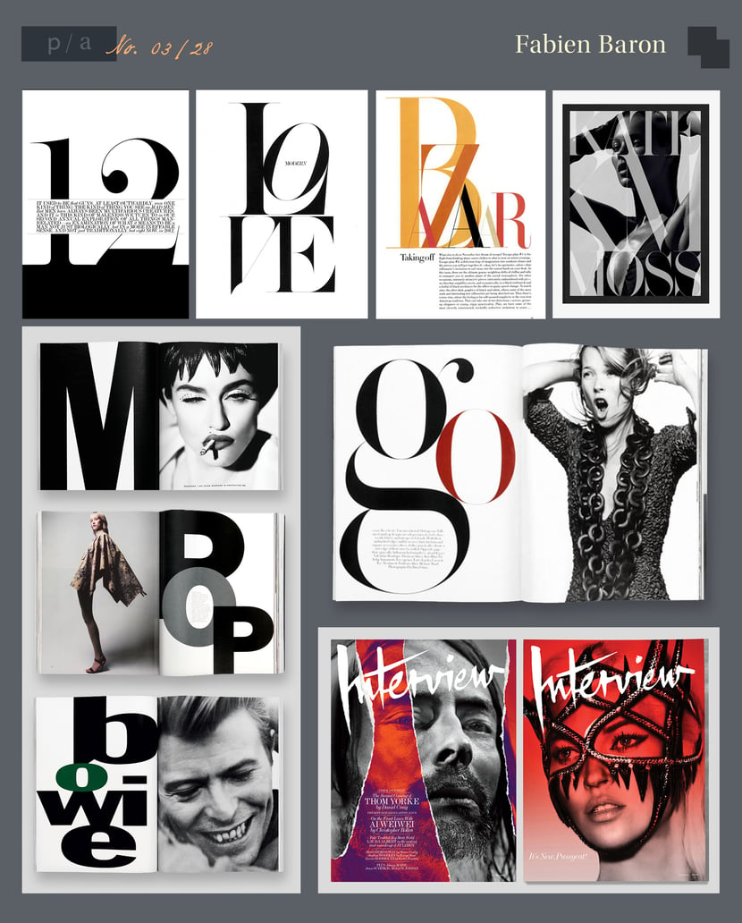
Fabien Baron (1959-) - French Fashion & Luxury Icon
Notable Works: Italian Vogue, Harper’s Bazaar, Interview, Calvin Klein, Burberry
Bio
Maybe he’s born with it… the magazine business was in Fabien Baron’s blood. His father was an art director for several French newspapers and magazines. Over the course of his career, Fabien Baron reinvented five prominent fashion magazines and created some of the most memorable ad campaigns in fashion and luxury brands. Vanity Fair called him “the most sought-after creative director in the world.”
In 1992, Baron was hired by Harper’s Bazaar to revamp the magazine. He created a truly distinctive look that was both bold and elegant. In that same year, he designed Madonna’s book and directed the documentary, Sex. He stirred more controversy in 2008 when he was asked to take over Interview magazine, founded by Andy Warhol. The magazine is known for intimate interviews with artists and creative thinkers. It was a perfect fit for Baron.
Style, Impact, and Observations
Fabien Baron targeted the emotional aspects of luxury brands and defined the genre’s lexicon for an entire generation. He treated each page like a sculpture, where he could shape and reflect the spaces he wanted to create.
Resources
https://www.printmag.com/podcasts/2021/design-matters%3A-fabien-baron/
https://go.distance.ncsu.edu/gd203/?p=27973
http://baron-baron.com/fabien-baron/
https://www.businessoffashion.com/fabien-barroncommunity/people
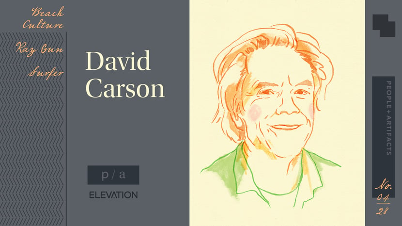
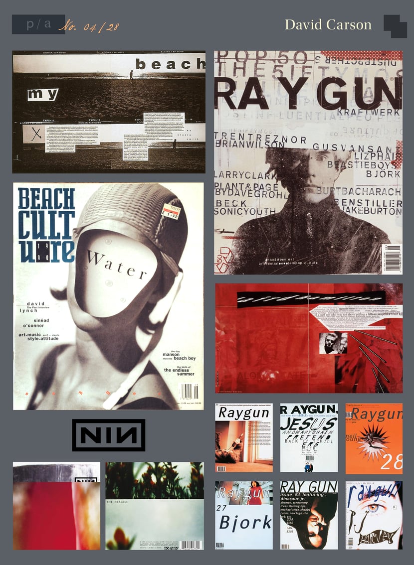
David Carson (1955 - ) - Surfer / Art Director
Notable Works: Beach Culture, Ray Gun
Bio
American graphic designer, art director and surfer, David Carson is best known for his use of experimental typography as the art director for Ray Gun magazine. He first made his mark with Beach Culture, a quarterly publication in 1989, and before subsequently working for Surfer magazine. He took on the role of art director of Ray Gun magazine in 1992.
Carson is widely considered to be the father of the “grunge typography” era.
Style, Impact, and Observations
Carson’s work features a dynamic relationship between words and pictures. It’s “self-indulgent” by his own admission, but his distinctive style comes from his choice to make the work personal and subjective. With a feeling of controlled chaos, David Carson shaped the look of youth culture and the postmodernism movement of the 1990s. He utilized the Mac’s programmatic, advanced technology to promote the vernacular.
Carson has an irreverent approach and made his name by ignoring the rules. “Use your eyes, not the rules,” he says.
Resources
https://medium.com/@underpressure/a-conversation-with-surfer-and-legendary-graphic-designer-david-carson-326c5f08042f
https://yvonnesqi.wordpress.com/2015/03/13/david-carson
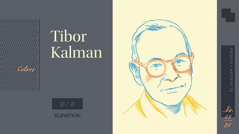
Tibor Kalman (1949-1999) - Activist ‘Bad Boy’ of Graphic Design
Notable Works: Colors
Bio
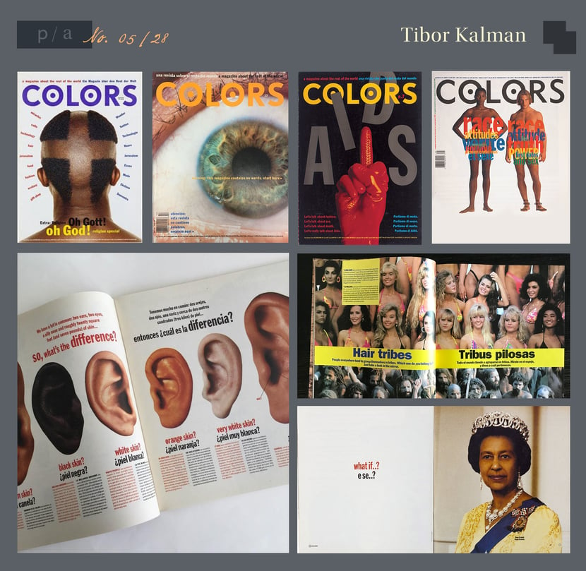
Tibor Kalman was born in Budapest in 1949. When his family had to flee the Communist Soviet regime in Hungary, he immigrated to New York in 1956. After he founded the design firm M&Co with friends, he became the Editor-in-Chief of Colors. An Italian/English magazine published by Italian clothing company Benetton, Colors was not a typical fashion magazine. It was billed as “the first magazine for the global village,” and Kalman used it as an outlet for his progressive ideas. Each issue covered a specific, and often controversial “dangerous idea,” covering race, gender inequality, and environmental issues.
Style, Impact, and Observations
Tibor Kalman was a self-proclaimed, ‘bad boy’ of graphic design in the 80s primarily because of his radical consciousness and social activism. He believed designers should take more responsibility for their work’s impact on society and culture. A champion of vernacular design, Kalman challenged the established international style of corporate design.
Kalman sought honesty and fought against anything he considered “formulaic” creative. His art direction was provocative and forced conversation on uncomfortable ideas.
Resources
https://www.nytimes.com/1999/05/05/arts/tibor-kalman-bad-boy-of-graphic-design-49-dies.html
https://go.distance.ncsu.edu/gd203/?p=52237
https://medium.com/@aattar/tibor-kalman-a-biography-be06906608e2
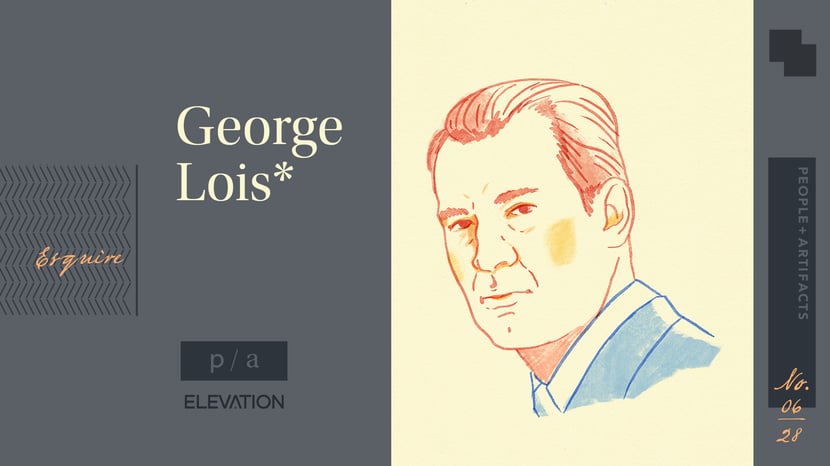
George Lois* (1931-) - Controversial Designer with an Asterisk
Notable Works: Esquire Magazine
*Several artists have come forward claiming that George Lois has taken credit for their work.
Bio
The son of Greek immigrants, George Lois was born in New York City. The formative years of college and his early career were cut short when he was drafted by the Army during the Korean War. Upon his return, Lois got a job in the Advertising and Promotions department at CBS.
A child of the 1950s ‘Creative Revolution,’ Lois was a prolific Ad Man. His approach to advertising was to uncover “The Big (i.e. smart) Idea” and to blur the lines of commercial art and art. His firm, Papert Koenig Lois (PKL), became the first advertising agency to ever go public on the stock exchange.
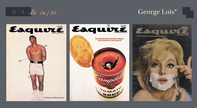
He is most recognized for the covers he designed for Esquire magazine in the 1960s.
Style, Impact, and Observations
Fusing the image and the word, the work done for Esquire magazine has both visual and verbal expressiveness that are indivisible from each other. With a strong emphasis on concept, Lois prioritized coming up with something unexpected. The imagery is forthright in meaning, but deceptively simple and disarming in design.
Resources
https://www.eyemagazine.com
https://www.famousgraphicdesigners.org/george-lois
http://adcglobal.org/hall-of-fame/george-lois/
People & Artifacts - A Design Deep Dive
Artist profile illustrations by Tonia Yiu.
Stay tuned for additional entries in this series covering the history of design. We will have profiles on pioneers in typography, motion design, and more.
Topics: visual storytelling, People & Artifacts | A Design Deep Dive